
How to Create a Mega Menu in Elementor Without a Plugin
A site menu starts out tiny. Home, About, Contact, done. Then a shop appears, the blog grows to a dozen categories, and a few landing pages get tacked on. Soon the header is jammed, some links drop to a second line, and people leave without finding what they wanted.
A mega menu fixes that. Better still, you can build a mega menu in Elementor without a plugin.

It’s the wide dropdown you see on big stores and news sites. Hover over “Shop” and a whole panel opens up: columns of links, small headings, maybe a photo. Everything’s visible at once. No digging.
Most tutorials tell you to install a plugin. It’s quick, sure. But your menu sits on every page, and a plugin adds extra files to every one of them. If Elementor can handle it alone, why not let it? It can, and there are two ways to do it. One needs Elementor Pro. The other uses a bit of CSS, for people on the free version.
Table of Contents
Why skip the plugin?
Fewer things to break, mostly. Themes update. Elementor updates. An older mega menu add-on can quietly stop working after either one, and because the menu lives in your header, the damage shows up across the whole site.
Speed is the other reason. A lighter header means faster pages, and both visitors and Google notice that. That’s the whole case for a mega menu in Elementor without a plugin: fewer moving parts and one less thing to update.
Here’s the catch, though. The easy method needs Pro. On the free version the CSS route works fine, it just asks for more patience and a bit more testing.
Here’s how the two methods compare at a glance.
| Method 1: Elementor Pro widget | Method 2: CSS | |
|---|---|---|
| Needs Elementor Pro | Yes | No, but your theme must let you edit the header |
| Setup | Mostly point and click | Classes plus a CSS snippet |
| Mobile menu | Breakpoint settings included | You write the mobile rules yourself |
| Maintenance | Low | Test again after theme updates |
| Best for | Client sites, stores, menus that change often | Small sites on a tight budget |
Plan it on paper first
Before opening Elementor, take a few minutes with a pen. Which menu items deserve a big panel? Maybe Services, Shop, Resources. How many columns would each need? Which links do you most want people to click?
It sounds dull. It saves a lot of rebuilding.
Building on a local copy first? Here’s how to move WordPress from localhost to a live server once the menu is ready.
Method 1: The Mega Menu widget (Elementor Pro)
Got Pro? Start here. It’s cleaner, and it’s what Elementor built for this job.
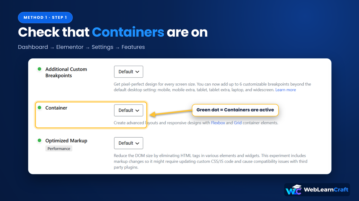
Start by opening Elementor → Settings → Features and confirming that Containers are on, since the widget depends on them. Save, then go to Templates → Theme Builder → Header. Edit your current header or create a new one. You’ll need one main container with your logo inside and some room for buttons.
Now search for “Mega Menu” in the widget list and drag it in. In some versions it shows up simply as “Menu”. A few placeholder items appear. Rename them, drag them around, delete the extras.

Here’s the bit that confuses people. Each item is either a Link or a Dropdown. A Link simply goes to a page. A Dropdown opens a panel that you design. So make Services and Shop Dropdowns, and leave Contact as a Link.

Click into a Dropdown item and Elementor gives you an empty container, basically a blank section. Fill it however suits your site. Three columns work well, each with a short heading and a few links, plus a banner on one side and a “View all” button underneath.

One rule I’d stick to: make the panels match. Same padding, same heading size, same link style. If one panel looks different, the whole menu starts to feel patchy.
On to the settings. Big sites with many categories usually suit full width. A smaller menu looks tidier with a narrower panel. Pick a soft animation (please, no bouncing) and choose the screen size where the menu flips to mobile.
The Style tab covers fonts, hover colours, spacing and the panel’s background. A light shadow and slightly rounded corners make the panel stand out.
When you’re happy, publish it, set the display condition to Entire Site, and open your live website. Click through every panel on desktop, tablet and phone. Start with the phone. It’s where trouble tends to hide.
Method 2: CSS (for free Elementor users)
Before anything else: you still have to be able to edit your header in Elementor. On the free version that depends on your theme, since Theme Builder is a Pro feature. If your theme says no, this method is off the table.
If your theme says yes, you can still build a mega menu in Elementor without a plugin, using plain CSS. Carry on.
Create a header container and name its class mega-header. Then add one container per top-level menu item, each with the class mega-item.
Inside every mega-item you’ll place two things. The first is a Heading or Button widget, which is the label visitors see (“Services”, for example). The second is another container with the class mega-panel, which is the big dropdown itself. Put your columns, links and images in it.

Now open Site Settings → Custom CSS and drop in the snippet below.
.mega-header {
    position: relative;
    z-index: 999;
}

.mega-item {
    position: static;
}

.mega-panel {
    position: absolute;
    top: 100%;
    left: 0;
    width: 100%;
    display: none;
    padding: 30px;
    background: #fff;
    box-shadow: 0 12px 30px rgba(0, 0, 0, 0.10);
    z-index: 9999;
}

.mega-item:hover > .mega-panel,
.mega-item:focus-within > .mega-panel {
    display: block;
}

.mega-panel a {
    text-decoration: none;
}

@media (max-width: 767px) {
    .mega-panel {
        position: static;
        width: 100%;
        padding: 20px;
        box-shadow: none;
    }
}
Here’s what the code does. The header becomes the reference point, so every panel can stretch to full width. Each panel stays hidden until someone hovers over its item. The focus-within line opens it for keyboard users too, which matters for accessibility.
Two things tend to go wrong. First, the panel may disappear as your mouse moves toward it. That points to a thin gap between the label and the panel, so adjust the top value until they touch. Second, the panel may slip behind a slider or sticky bar. A higher z-index usually brings it forward.
Touch screens are this method’s weak spot, since phones don’t hover. Test it, and expect to adjust things. It also gets awkward if your panels are complicated. On client work, or a site that changes often, Pro is the safer bet.
Don’t forget mobile
Over half of web traffic comes from phones. A mega menu that only works on a big monitor is a poor deal for most visitors.
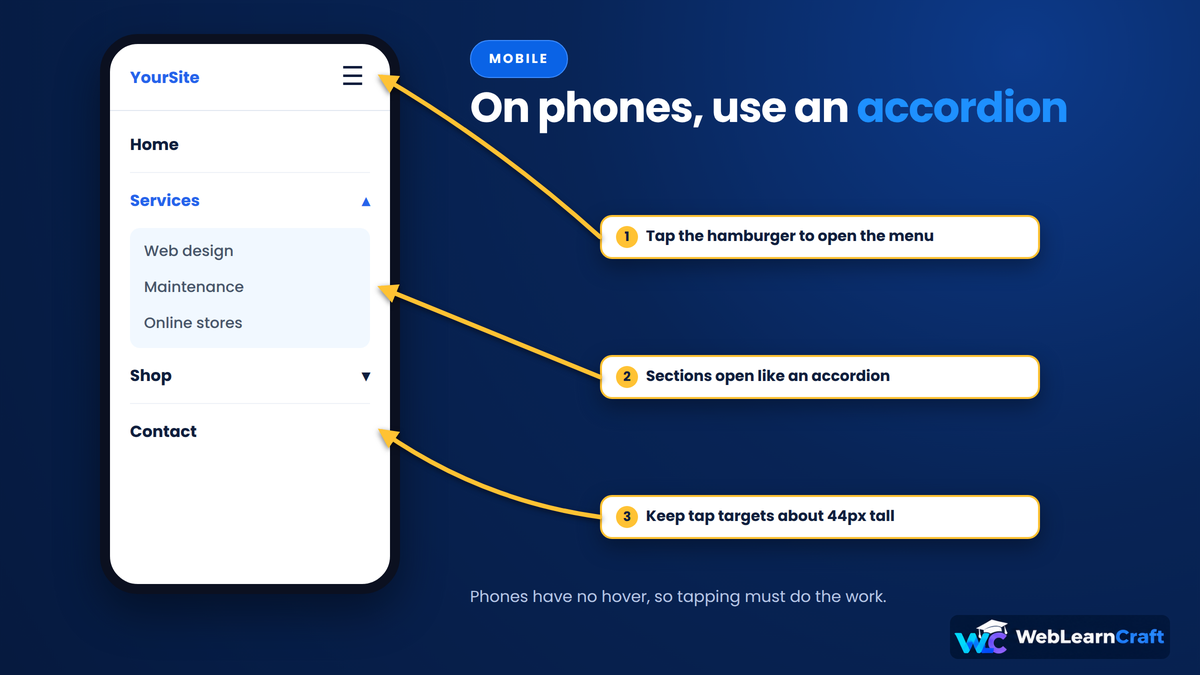
For small screens, go with a hamburger or accordion. Stack your columns. Hide large banners, because they push the links far down the page. Keep tap targets about 44 pixels tall so thumbs can hit them, and don’t rely on hover at all.
Elementor has small device icons at the bottom of the editor. Use them to preview tablet and mobile on their own, since each often breaks differently.
SEO basics for menus
A menu appears on every page, so search engines look at it closely. You can use that.
Link to the pages you actually want to rank, such as main services, top categories and your best guides. And write anchor text that says something. “Web Design Services” beats “Click here” every time.
Don’t go overboard, though. Thirty links in one panel won’t help anyone, and a handful of clear groups reads far better than a wall of text. Use real links, since buttons that rely on JavaScript to navigate might be skipped by search engines. Google explains this in its guide to crawlable links. Compress every image too. A heavy banner in the menu quietly slows the whole page.
When something breaks
If the panel won’t open, check the item type first. In Method 1 it must be set to Dropdown. In Method 2, make sure the class names match the CSS exactly, because one typo breaks it.
If it hides behind another section, raise the z-index. If it closes too fast, remove the gap or add a little padding at the top of the panel. If mobile looks odd, check your breakpoints.
Saved your changes but nothing updated? Go to Elementor → Tools → Regenerate CSS & Data, then clear your cache plugin and CDN. That one catches a lot of people.
Wrapping it up
A mega menu in Elementor without a plugin is completely doable. Pro users get a proper widget, and everyone else can get by with a short CSS snippet and a bit of patience.
Sketch the layout first, keep every panel consistent, check it on your phone before going live, and link only to pages that earn the spot. That covers most of it.
Need help with a step, or with your site in general? Contact us and we’ll point you the right way.
ho bro your content is very useful.
Best website for WordPress learning